
Uniflor · Institutional media
Around town.
I presented the identity
beyond the screen.
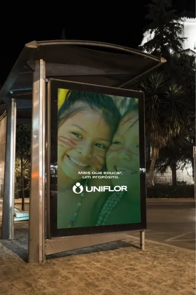 Enlarge
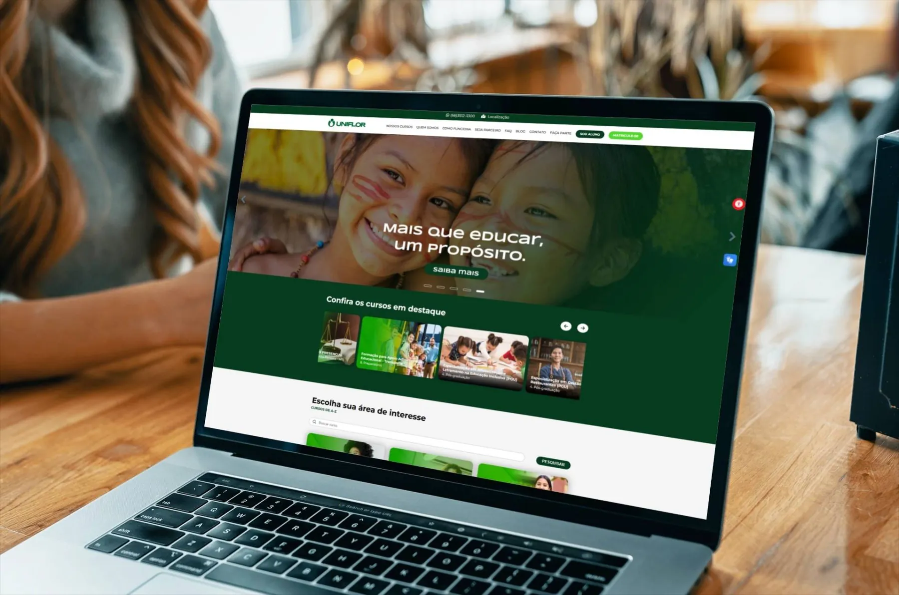
Selected work/Uniflor/Rebrand · Website
I redesigned Uniflor while preserving its symbol, concept and brand values.
See what I kept and what I changedI started with the identity and history Uniflor had already established. My challenge was to evolve the brand while keeping the qualities that defined it.

I kept the symbol.
I simplified the shapes.
I organized the elements.
I simplified the shapes and organized the elements around the existing symbol and concept. The resulting identity feels lighter and more contemporary.
I kept the symbol and defined how to apply its variations.

Uniflor · Identity variations
I kept the symbol's character.
I explored new ways to use it.
Uniflor · Identity in use
I redesigned the identity to improve its legibility, versatility and consistency across social media, mobile screens, other digital formats and institutional materials.
I organized the color palette so the identity would stay consistent across applications.

Primary green
#006633RGB 0 · 102 · 51Explore the brand colors
Brand typography
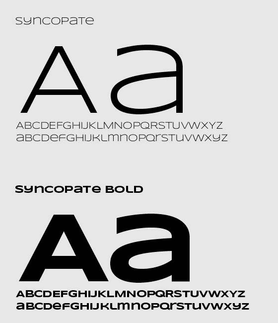
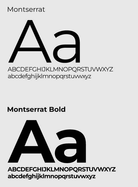
I presented the identity across several touchpoints.
Next case study 02 / 09
All projectsA spa menu shaped by the ocean
Explore case study