Trust
I expressed security and credibility through a solid, elegant and recognizable visual identity.

Work/Atual Câmbio
I built a brand to bring people closer to international transactions and make security feel more human.
Explore the case studyAtual Câmbio
Positioning · Identity · Communications
My challenge was to convey trust, professionalism and security in a voice people could relate to. I used the positioning to guide the identity and communications.
During discovery, I identified four principles to guide the Atual brand experience.
I expressed security and credibility through a solid, elegant and recognizable visual identity.
I defined an approachable, accessible voice for people and businesses.
I created a brand platform to guide communications, from customer service to institutional campaigns.
I connected the brand to the projects, dreams and achievements that take people across borders.
From reference to identity
I drew on a historical reference and reinterpreted it for a contemporary brand.
I researched the Knights Templar and the Order of Christ for visual references to trust, protection and connections between places.
I drew the mark from the letter A and incorporated elements inspired by the historical crosses associated with the Order of Christ.
I used that reference to create a solid, elegant identity. Its meaning guided the form.
The identity in use
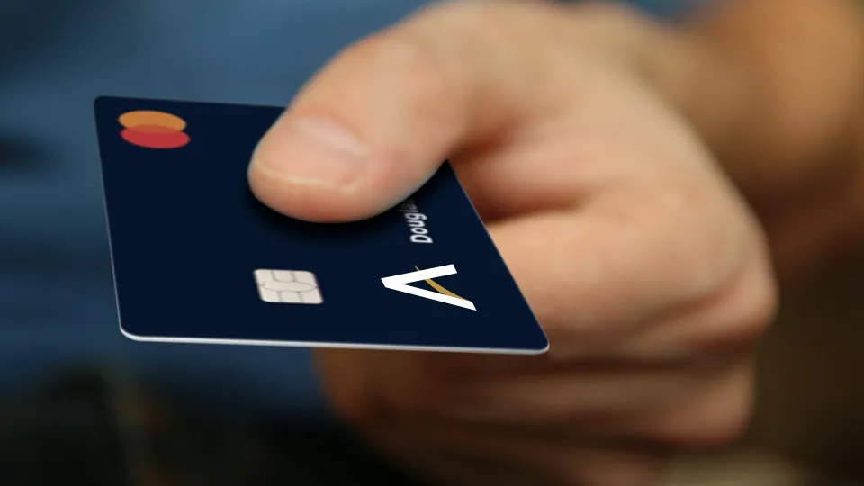
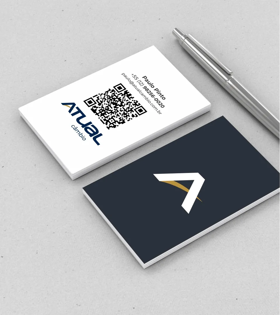
I brought the visual identity to customer touchpoints to express the approachable positioning.
View full imageThe visual system
I used color and applications to express the brand promise.
I explored how the identity could work across printed materials and physical objects.
I created these videos for Atual and adapted the identity for film and social media.
@atualcambio · View on InstagramReels · @atualcambio
I created and edited Atual’s Instagram Reels in Premiere: the specialist talks to camera and each video answers one question about money, the dollar and international payments. A hook in the first line, captions, B-roll and a tight pace.
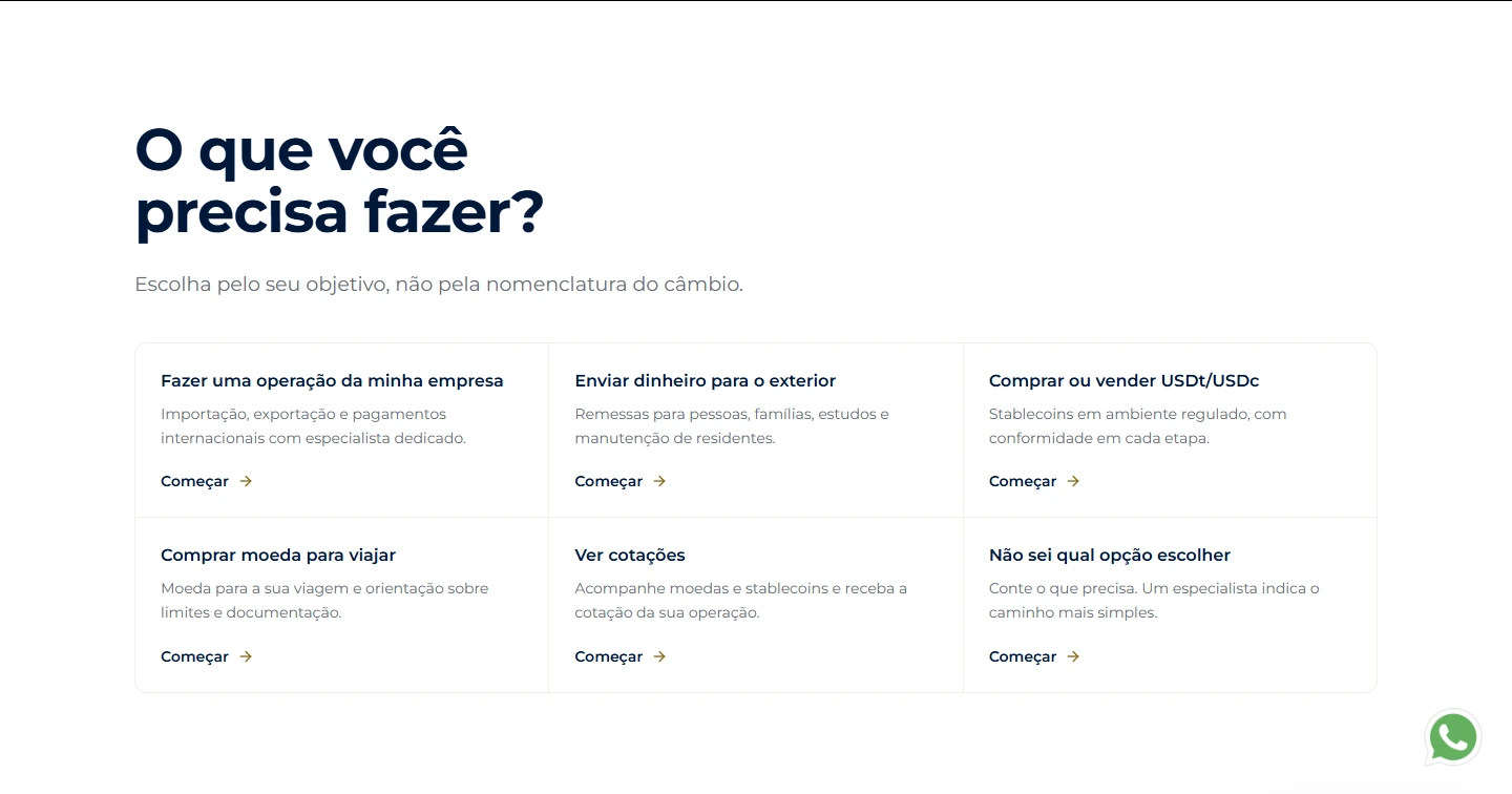
See them all on InstagramI also helped create Atual’s website. I organized navigation around what visitors want to do, connecting services, content and contact options.
Visit the websiteI connected positioning, identity and narrative, then applied that direction to the website, films and digital materials I created for Atual.

Let’s talk
Next case study 04 / 09
All projectsFrom first step to lasting habit
Explore case study