Projects/TokenHub
From property
to portfolio.
I designed and built the new website and the investor platform for TokenHub, a real estate tokenization company. From the first click to tracking a portfolio, in one experience.
- Client
- TokenHub
- Sector
- Fintech · Tokenization
- My role
- Web design · Platform UI · Front-end
- Year
- 2026
The challenge
Property investing with the clarity of an app.
TokenHub turns real estate into digital tokens so more people can invest with smaller amounts. It needed a website that explains this without jargon, and an investor area on par with the biggest platforms in the market.
The benchmark was Tokeniza, the sector leader in Brazil: I studied its structure and user journeys. The brand, the language and every screen are TokenHub’s own, designed from its identity manual.
The brand
One system, from website to statement.
I applied TokenHub’s manual across the whole experience: navy for brand and navigation areas, cyan for highlights and actions, and Raleway with aligned numerals in the financial areas. The money side is light on purpose, to make reading and comparing easier.
 #083650
The website
Explain before selling.
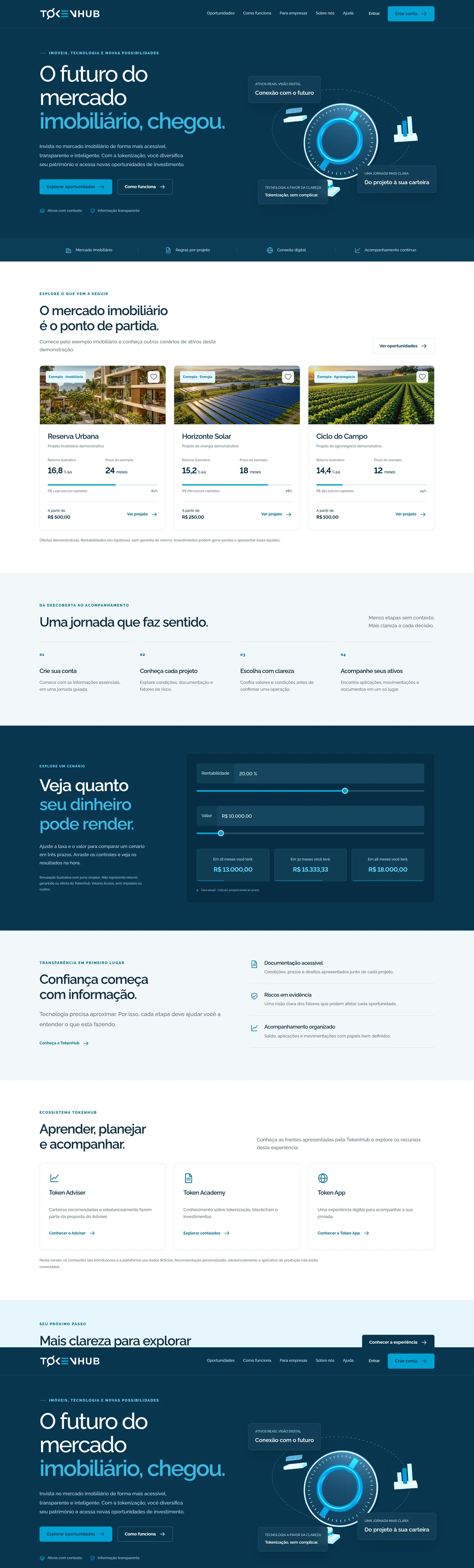
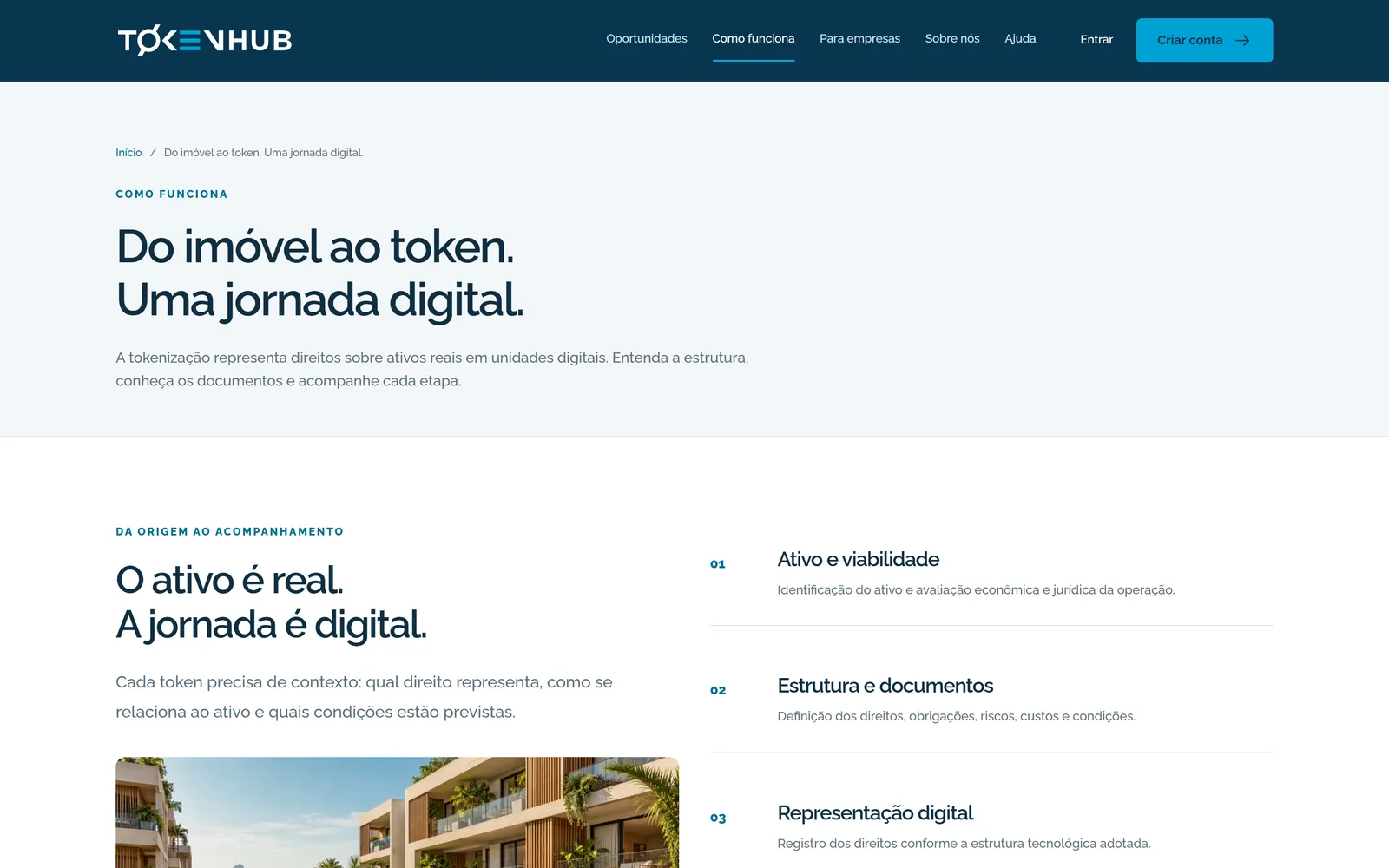
The home page introduces tokenization with a Three.js scene that reacts to the pointer, shows sample projects with returns labelled as hypothetical, offers a simulator and explains the journey in four steps. Scroll the page inside the screen.
The platform
The investor area, screen by screen.
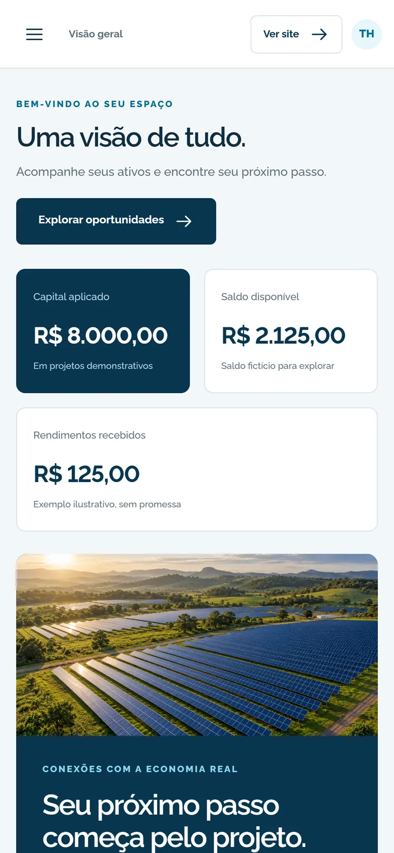
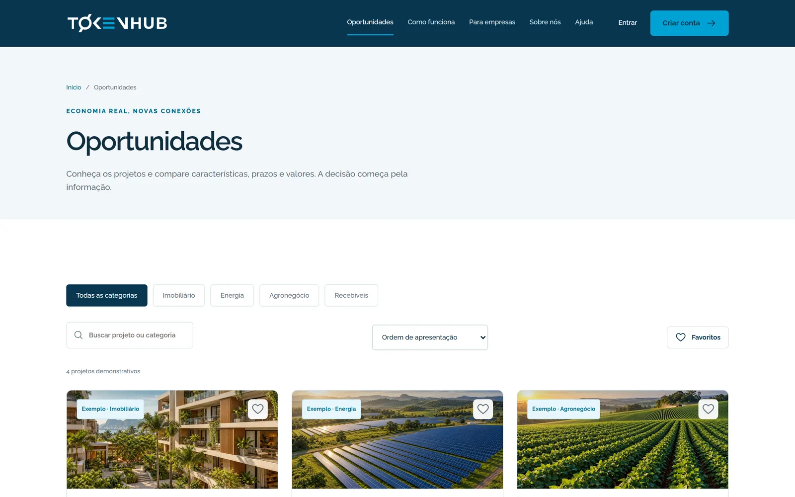
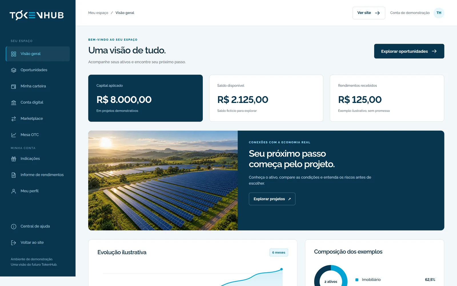
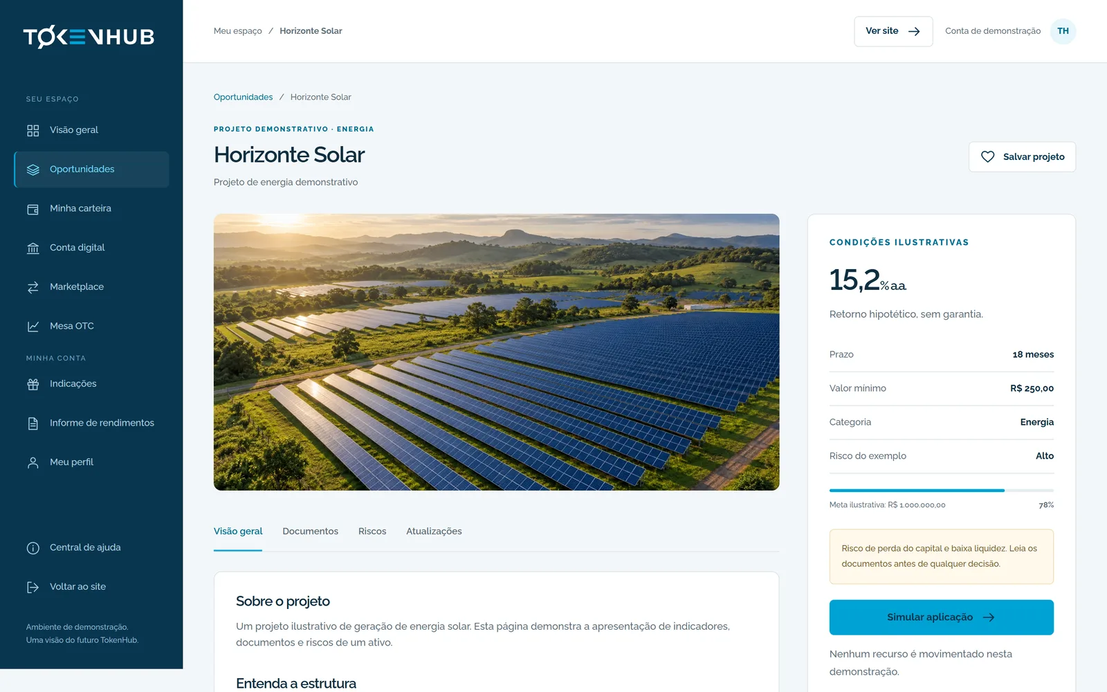
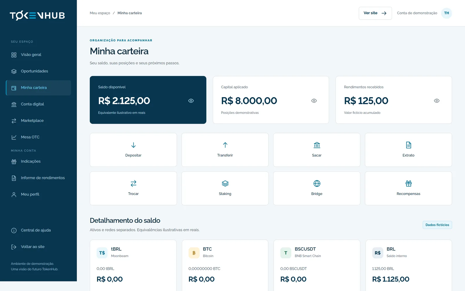
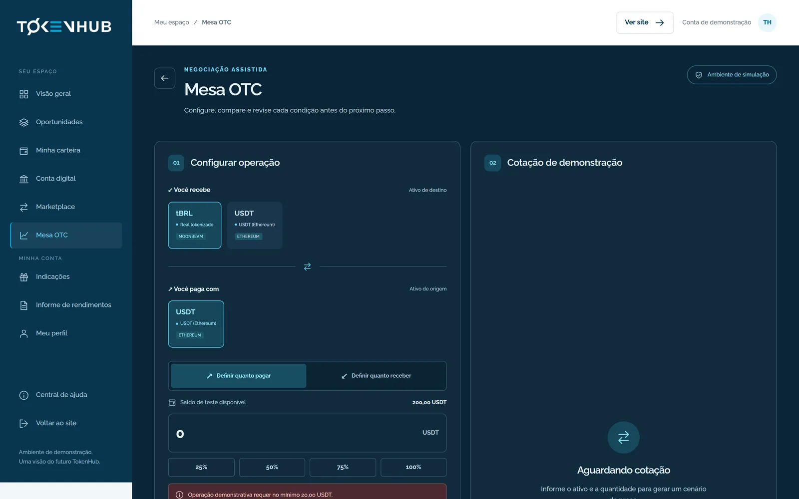
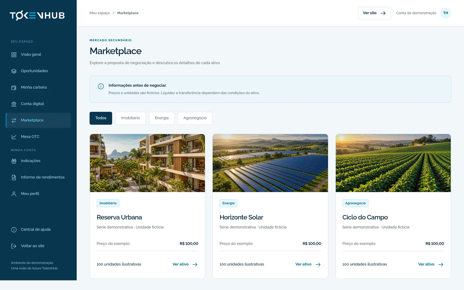
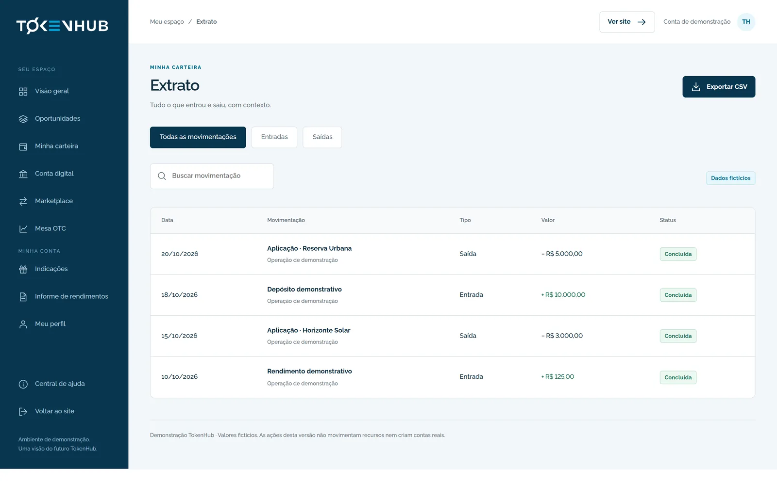
Overview, opportunities, project detail, wallet, digital account, marketplace, OTC desk, statement, referrals and profile. One fixed side navigation, the same hierarchy on every screen.
On mobile
The portfolio fits in a pocket.
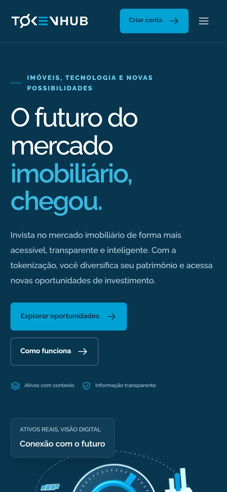
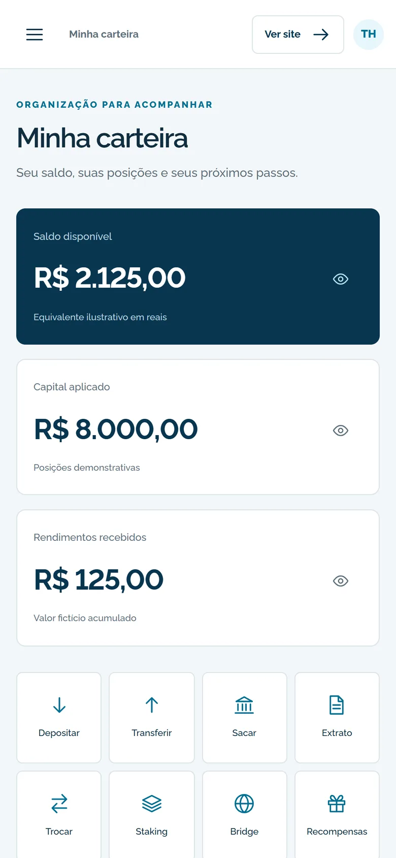
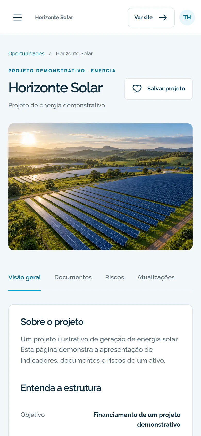
I reviewed every screen at 375, 768, 1024 and 1440 px. On phones, navigation becomes a menu, cards stack and long tables scroll inside their own block without breaking the page.
Decisions
Trust is designed in the details.
- Returns are hypotheses. Every yield is labelled as an example, and no ranking pushes the decision by the biggest number alone.
- Risk is never colour alone. Status and risk always carry text; colour only reinforces it.
- Privacy on screen. Each balance can be hidden on its own, for anyone opening their wallet in public.
- Quotes that expire. On the OTC desk, the quote shows its validity before you confirm.
- For everyone. Native buttons, labelled fields, visible focus, keyboard tabs, native dialogs and reduced motion respected.
I delivered the complete website and platform interface in HTML, CSS and JavaScript, with demo data. Real sign-up, custody, payments and server integrations belong to the engineering phase.
Your platform can build trust too.
Talk about my projectNext case study 01 / 09
All projectsUniflor
A rebrand that keeps the essentials
Explore case study